Challenge
Money apps need to feel simple and secure. The goal was a landing page that explained the app's benefits clearly, reassured visitors, and encouraged downloads.

The payment app landing page was designed to explain a financial product quickly and build trust from the first screen. Clean layouts, clear feature sections, and prominent download buttons help visitors understand the app and install it.
Built on WordPress with a mobile-first layout, the page works smoothly on every device. The result is a focused, conversion-driven landing page for a payment app.
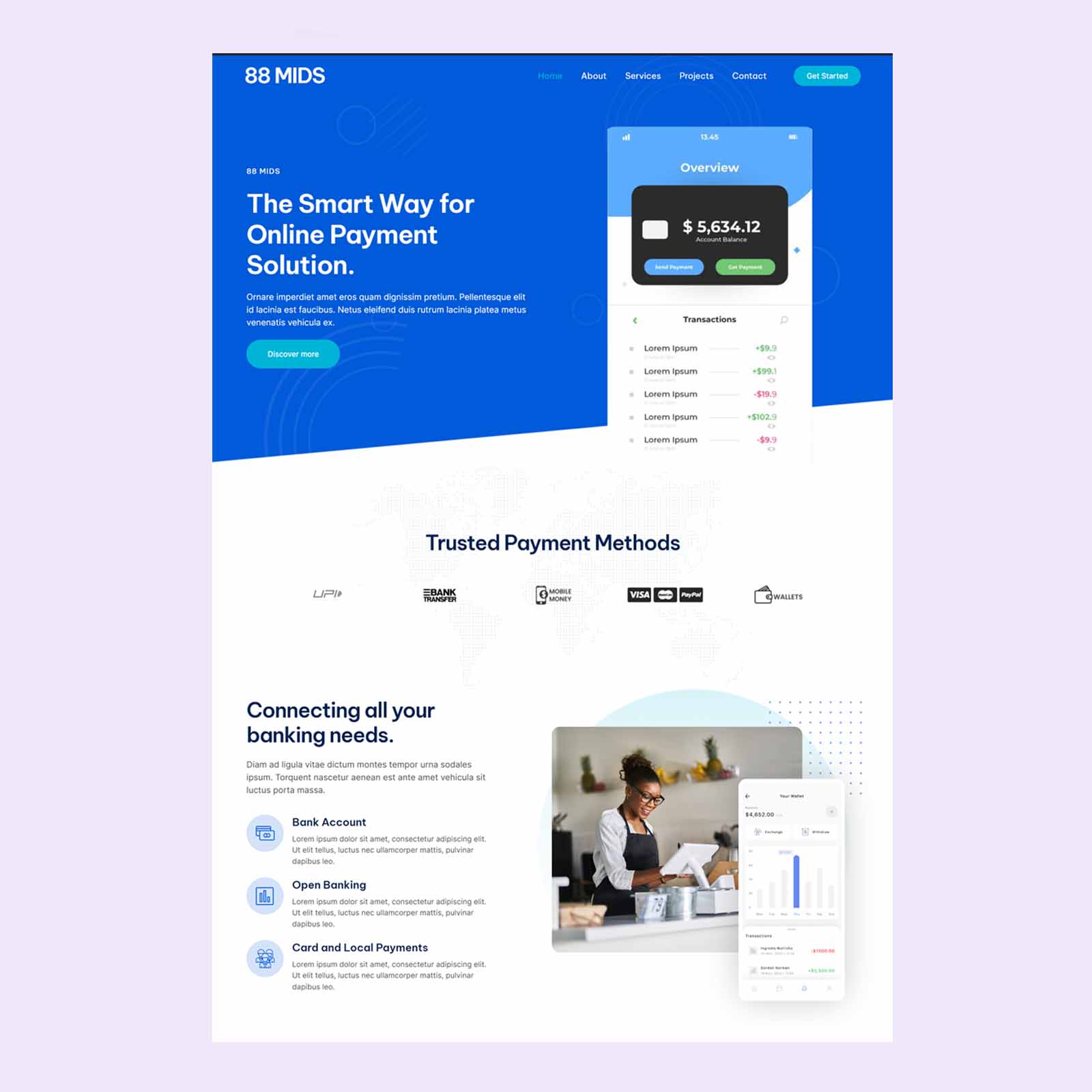
Payment App Landing Page Design. A payment app asks users to trust it with their money, so the first impression counts. This project delivered a payment app landing page on WordPress that explains the product simply, reassures visitors about security, and makes downloading the app effortless.
A Clear Opening Message
The top of the page presents a short, direct headline, a supporting line, and a visible download button. Visitors immediately understand what the app does and what to do next.
Simple, Benefit-Led Features
Key features, such as fast transfers, easy payments, and transaction tracking, are explained in concise sections with clear icons. The focus on everyday benefits makes the app feel useful and approachable rather than technical.
Building Trust and Security Confidence
Financial products require reassurance. The page includes space for security highlights, user feedback, and clear, honest explanations, helping visitors feel comfortable before they install.
Showing the App
App screens and a short how-it-works section let visitors preview the experience. Seeing a simple, clean interface reduces uncertainty and encourages downloads.
Mobile-First Design
Because users will often visit the page from their phones, the layout was designed mobile-first. Large buttons, readable text, and quick loading keep the experience smooth on small screens.
Download Calls to Action
Store buttons and download prompts appear at natural decision points throughout the page. Repeating the main action at the right moments helps convert interest into installs.
Making the Most of the Budget
With a budget of $300, every design decision had to earn its place. Effort was focused on the elements that influence results most, including a clear message, a strong structure, trust-building content, and simple calls to action, rather than on unnecessary extras. The result is a lean, professional website that delivers what the business needs and can be extended easily as it grows.
Collaboration and Feedback
Good design is a collaboration. Throughout the project, the business had the chance to review the layout, share feedback, and request refinements before the website was finalised. Feedback was applied carefully, balancing the preferences of the business with what works best for visitors in the fintech & payments sector. This step-by-step approach keeps the project efficient and ensures the final result is something the team is proud to share.
A Search-Friendly Foundation
Every page was built with a strong technical foundation, including a logical heading structure, descriptive page titles, optimised images, and fast loading. These details help search engines understand the content and help visitors find what they need without delay. Combined with clear, focused wording about fintech & payments, the structure supports visibility for people searching for exactly this kind of service, and it gives the business a solid base for future content and growth.
The Final Result
The finished landing page gives the business a polished, professional online presence that explains its offer clearly, builds trust with visitors, and supports a steady flow of enquiries. It shows how thoughtful design and a clear structure can deliver strong results within a practical budget.
A considered process helps bring the right ideas to life.
Money apps need to feel simple and secure. The goal was a landing page that explained the app's benefits clearly, reassured visitors, and encouraged downloads.
We designed a clean, mobile-first page with a strong opening headline, concise feature sections, security messaging, and download buttons placed at key moments.
The finished landing page presents the app as modern, easy to use, and trustworthy, with a straightforward path to installation.