Challenge
Software products must explain their value quickly. The goal was a website that made automation benefits clear, looked credible, and drove demo requests and sign-ups.
The SaaS automation website was designed around a dark blue colour scheme that conveys technology, trust, and focus. Clear feature sections, concise benefits, and prominent demo and sign-up buttons help visitors understand the product and take action.
Built on WordPress with a fully responsive layout, the website delivers a consistent experience on every device. The result is a modern, conversion-focused site for a software product.
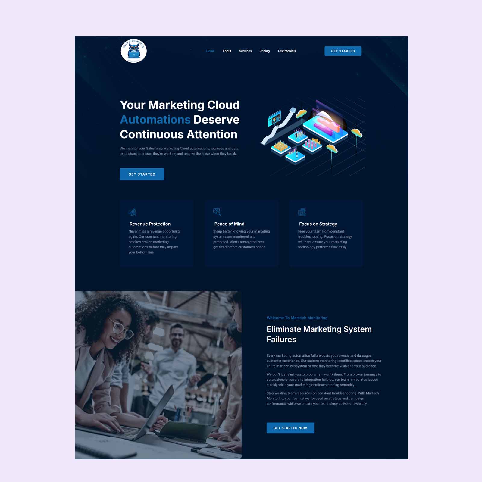
SaaS Automation Website Design. SaaS visitors decide quickly whether a product is relevant, so the website must explain it fast. This project delivered a SaaS automation website on WordPress, built around a dark blue colour scheme and a clear structure that helps visitors understand the product’s value within seconds.
A Dark Blue Colour Scheme
Deep blue tones form the base of the design, supported by crisp white text and bright accent colours for buttons and highlights. The palette feels modern and trustworthy, and strong contrast keeps the interface comfortable to read.
A Clear Value Proposition
The opening section states what the product does and who it helps in a short, direct headline, supported by a clear action button. Visitors can understand the core benefit without scrolling or reading long paragraphs.
Feature Sections That Explain
Automation features are presented in structured sections, each with an icon, a short title, and a benefit-led description. This format makes the product easy to scan and keeps complex capabilities approachable.
Showing How It Works
A simple step-by-step overview explains how users set up and benefit from the automation. Seeing the process reduces perceived effort and helps visitors imagine using the product.
Building Credibility
Space for customer feedback, integrations, and key benefits gives the product social proof. These elements help reassure new visitors that the software is reliable and used by real businesses.
Fast and Responsive
The WordPress build was kept lightweight for quick loading, and the layout adapts cleanly to desktop, tablet, and mobile. Clear sign-up and demo buttons remain easy to find on every screen.
Making the Most of the Budget
With a budget of $350, every design decision had to earn its place. Effort was focused on the elements that influence results most, including a clear message, a strong structure, trust-building content, and simple calls to action, rather than on unnecessary extras. The result is a lean, professional website that delivers what the business needs and can be extended easily as it grows.
Collaboration and Feedback
Good design is a collaboration. Throughout the project, the business had the chance to review the layout, share feedback, and request refinements before the website was finalised. Feedback was applied carefully, balancing the preferences of the business with what works best for visitors in the saas & automation sector. This step-by-step approach keeps the project efficient and ensures the final result is something the team is proud to share.
A Search-Friendly Foundation
Every page was built with a strong technical foundation, including a logical heading structure, descriptive page titles, optimised images, and fast loading. These details help search engines understand the content and help visitors find what they need without delay. Combined with clear, focused wording about saas & automation, the structure supports visibility for people searching for exactly this kind of service, and it gives the business a solid base for future content and growth.
The Final Result
The finished website gives the business a polished, professional online presence that explains its offer clearly, builds trust with visitors, and supports a steady flow of enquiries. It shows how thoughtful design and a clear structure can deliver strong results within a practical budget.
A considered process helps bring the right ideas to life.
Software products must explain their value quickly. The goal was a website that made automation benefits clear, looked credible, and drove demo requests and sign-ups.
We designed a dark blue interface with structured feature sections, simple visual explanations, and calls to action placed at natural decision points.
The finished website presents the product as modern, reliable, and easy to understand, with a clear path from interest to sign-up.